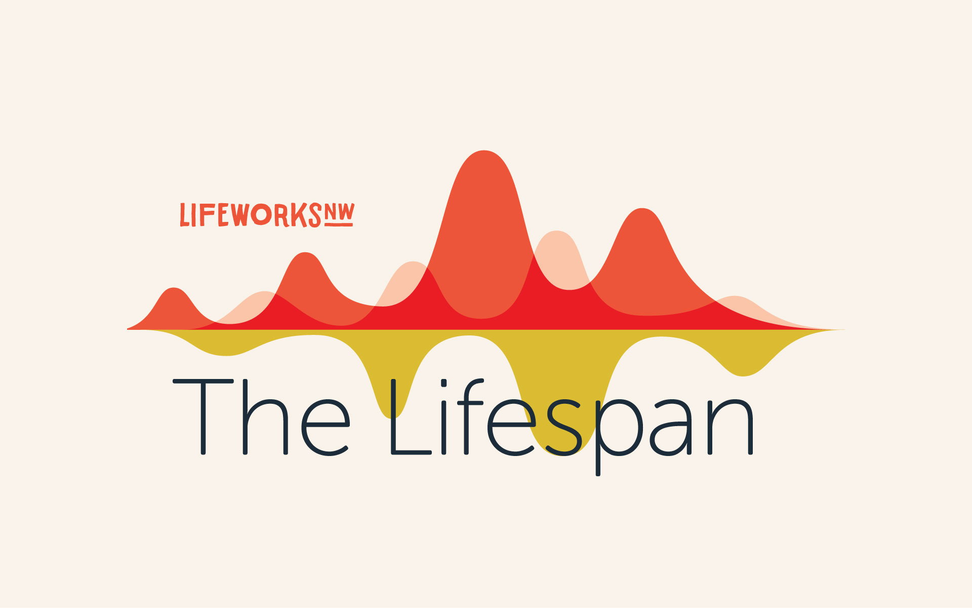
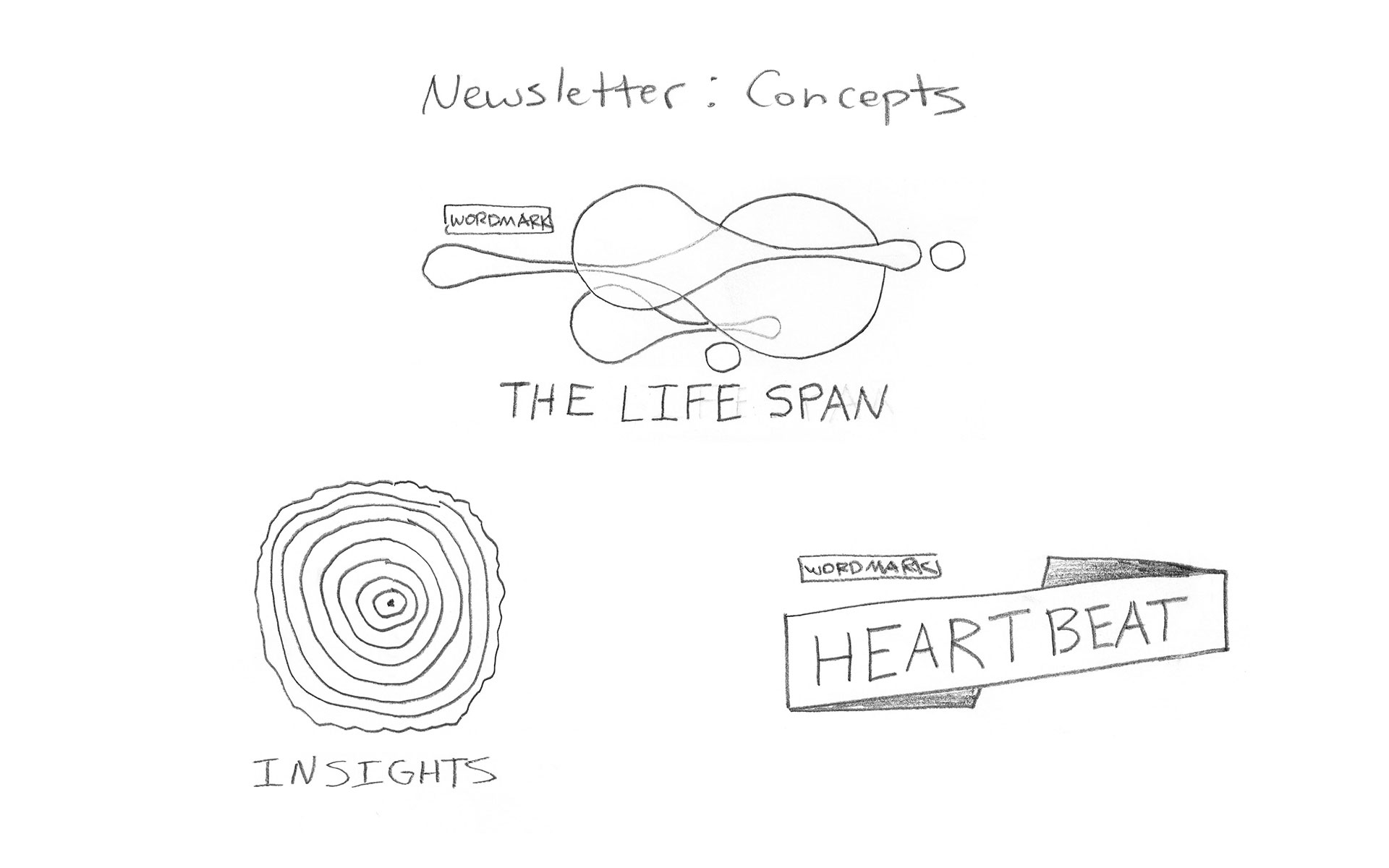
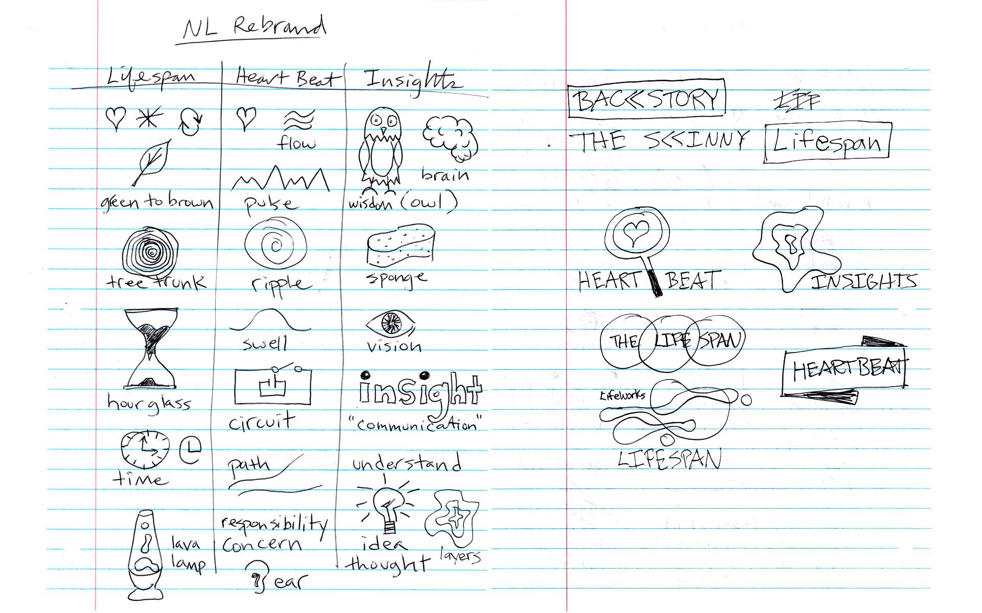
This internal email newsletter is published weekly to help hundreds of employees stay informed and feel better connected to the organization. The overlapping fluid forms represent one's journey through life (i.e. our lifespans) and how we're all interconnected. I also designed an email template to help streamline distribution.


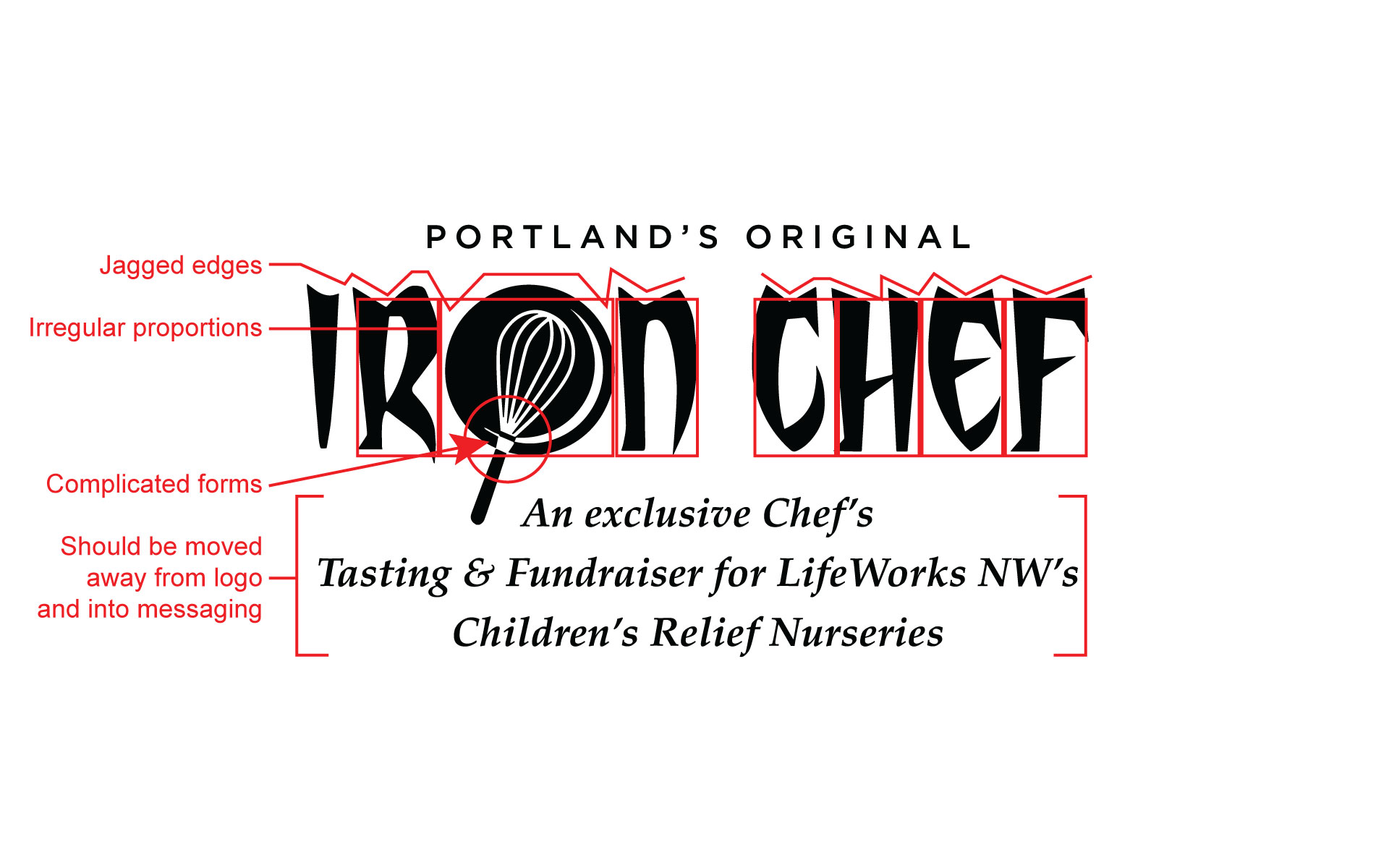
Iron Chef was a long running fundraiser for LifeWorks NW children's relief nurseries. In promotional of the event, a brand refresh extended to both print collateral and digital media. The event theme varied from year to year, but the Iron Chef mark and signature colors remained the same.
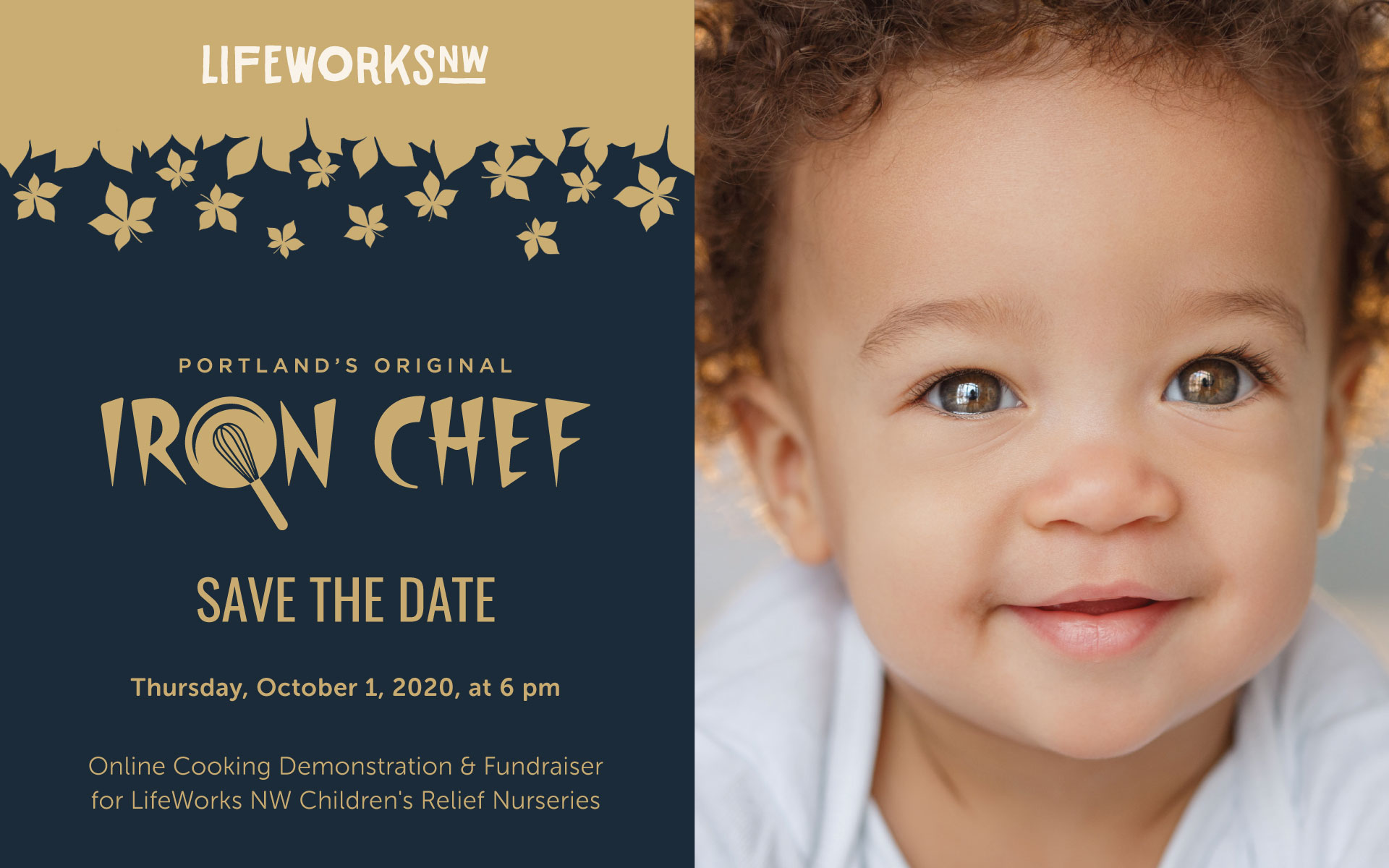
Design of these three logos was undertaken as either a volunteer or passion project.
The Beach Ball was a local school fundraiser (live and silent auctions) set to a Miami Vice theme.
VR (Vintage Robots) is my Tumblr blog dedicated to that very topic.
dMob is a networking event I established for Portland creatives through AIGA in 2003.
